A rebrand to be proud about
The Glo Center calls Springfield, MO home and represents a diverse and thriving LGBT community. They’ve created a space where anyone can feel comfortable and valid. For the rebrand, I sought to bring that comfort and representation into a modern visual system that allows for flexible use of logo and color. The new logo is used in an updated website that aims to engage users more on events and encourage donations. New merchandise and business cards allow for more representation in Springfield itself. You’ll find in this project that The GLO center’s voice is amplified with this new system and allows for a greater reach to those who seek representation and the allies that wish to support.

Black and White Logo

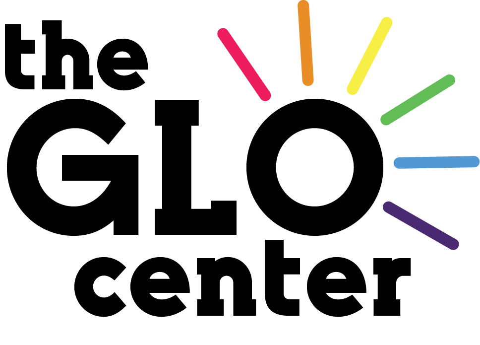
Full Color Logo
COLOR PALETTE
The color palette was inspired by the colors of pride. You can see them represented in the full-color logo as each individual ray surrounding the “O”. Like taking a prism to a beam of light, we can extract each individual color and use it for various reasons and events.


Promotional/merchandise Design
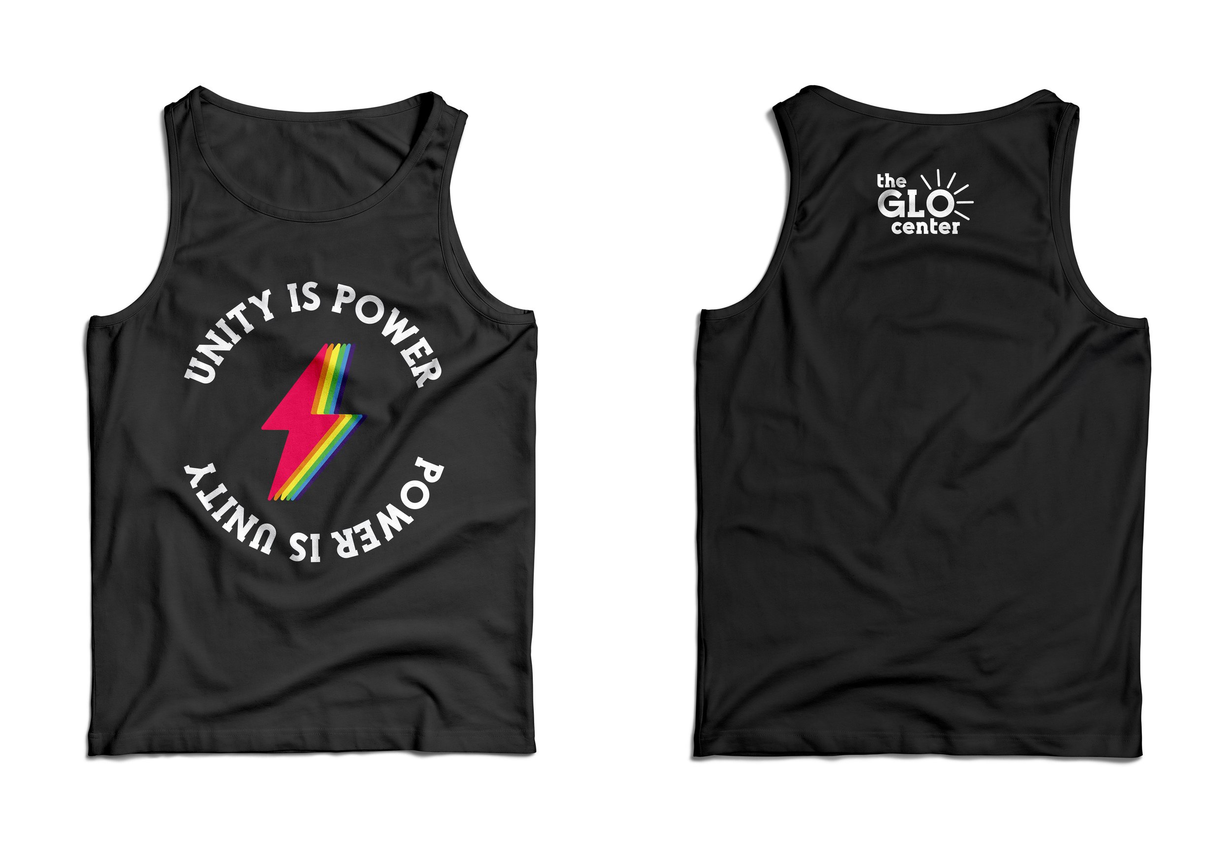
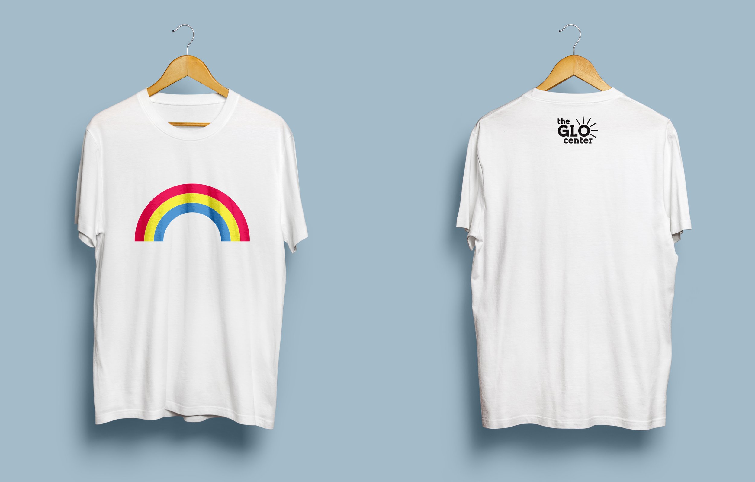
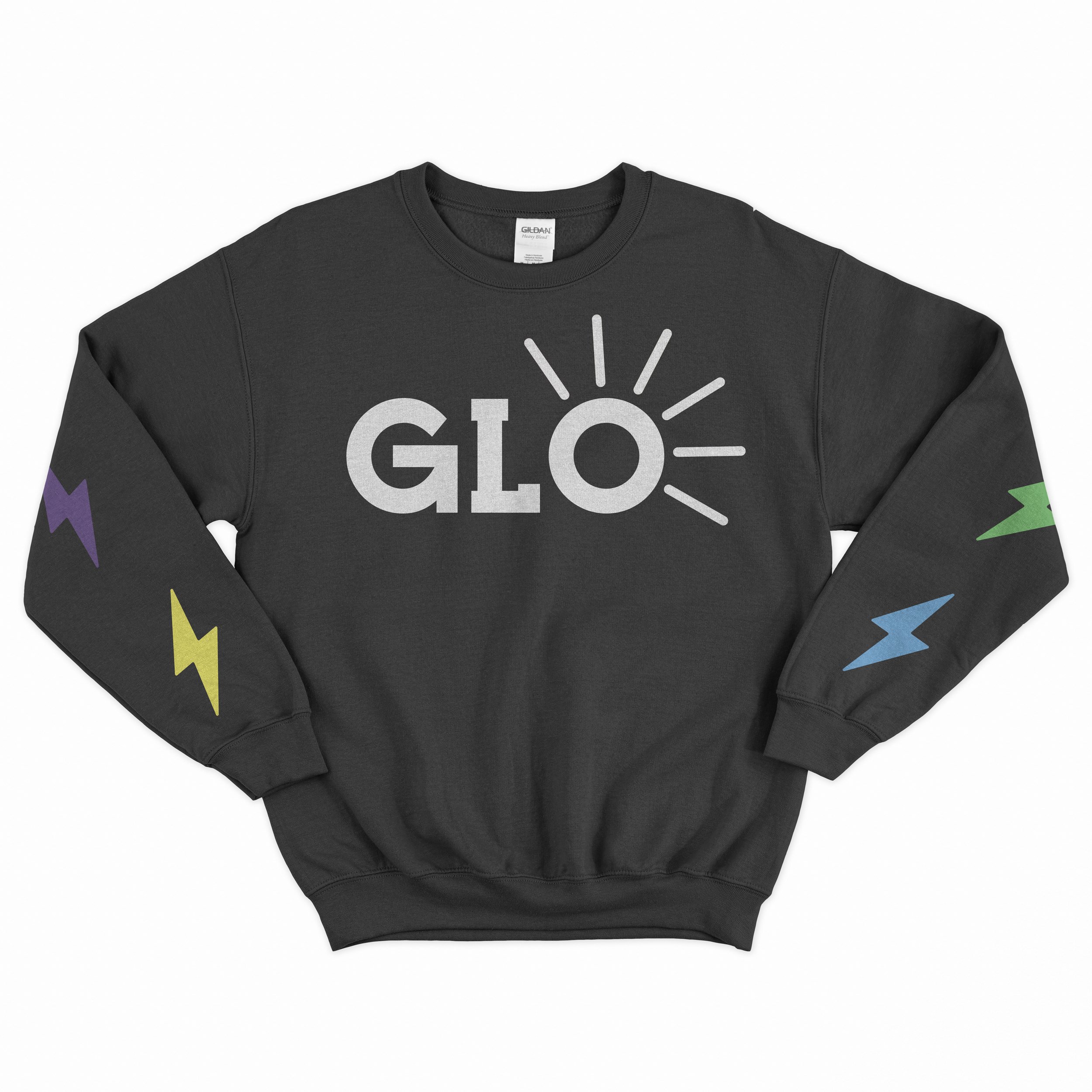
Here are some examples of various promotional designs using the new logo. Each uses a variety of colors and people to promote diversity and unity for the LGBTQ+ community. Also given are examples of merchandise the Glo Center can sell for repping the brand, the styles incorporate the logo with other elements to create a fun flare to them.

Web Banner Ad
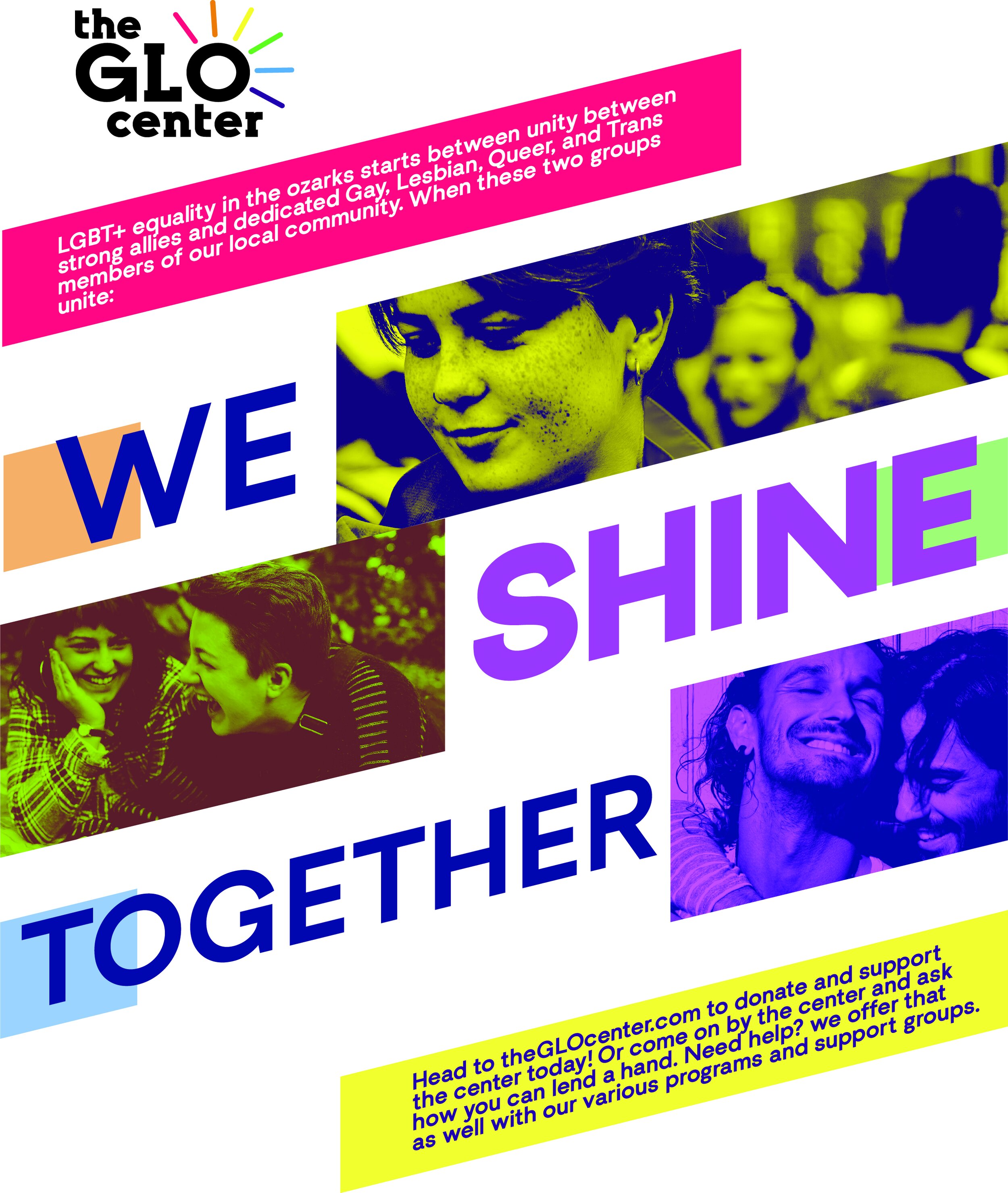
Printed Flyer Style Ad
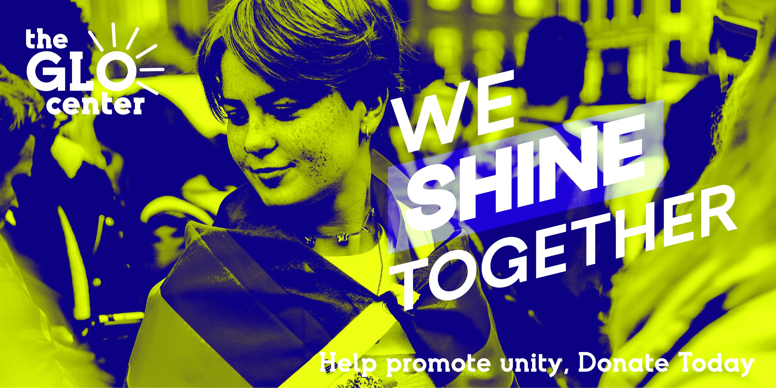
Facebook Ad

